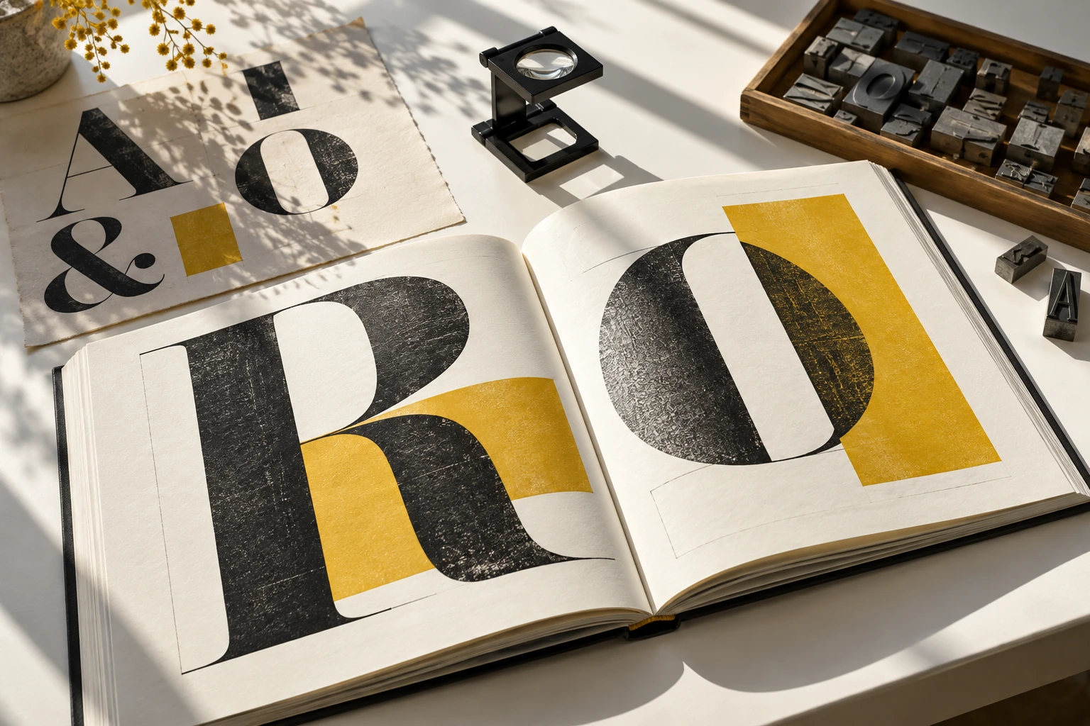
The reader is part of the composition
The reading room connects typography to practical tasks: entering a text, following its argument and returning to a detail. The specimen makes a few relationships visible without pretending that one setting suits every page.
Typography as a reading decision
Turevasko examines the relationship between a page’s visible structure and the reader’s next move. The print-room imagery is independently produced illustration, not a record of an actual publisher, client job or teaching institution. No premises, course schedule or professional membership is offered.
Use the live specimen to notice the effect of one typographic change. Then work through the proof-reading exercise on a physical page. Keep the reasons for your choices alongside the result; attractive type alone cannot decide whether a sequence is readable.