One paragraph, three rhythms
Set the same paragraph at three measures. Keep the type size consistent and compare the return from the end of one line to the next.
Turevasko / Read the page
Margins, type, spacing and sequence shape the way an idea reaches a reader. This is a fieldguide to making those choices with care.
Begin with the reader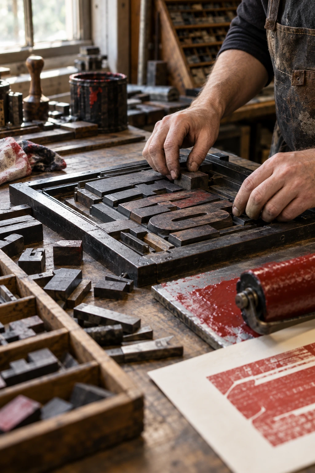
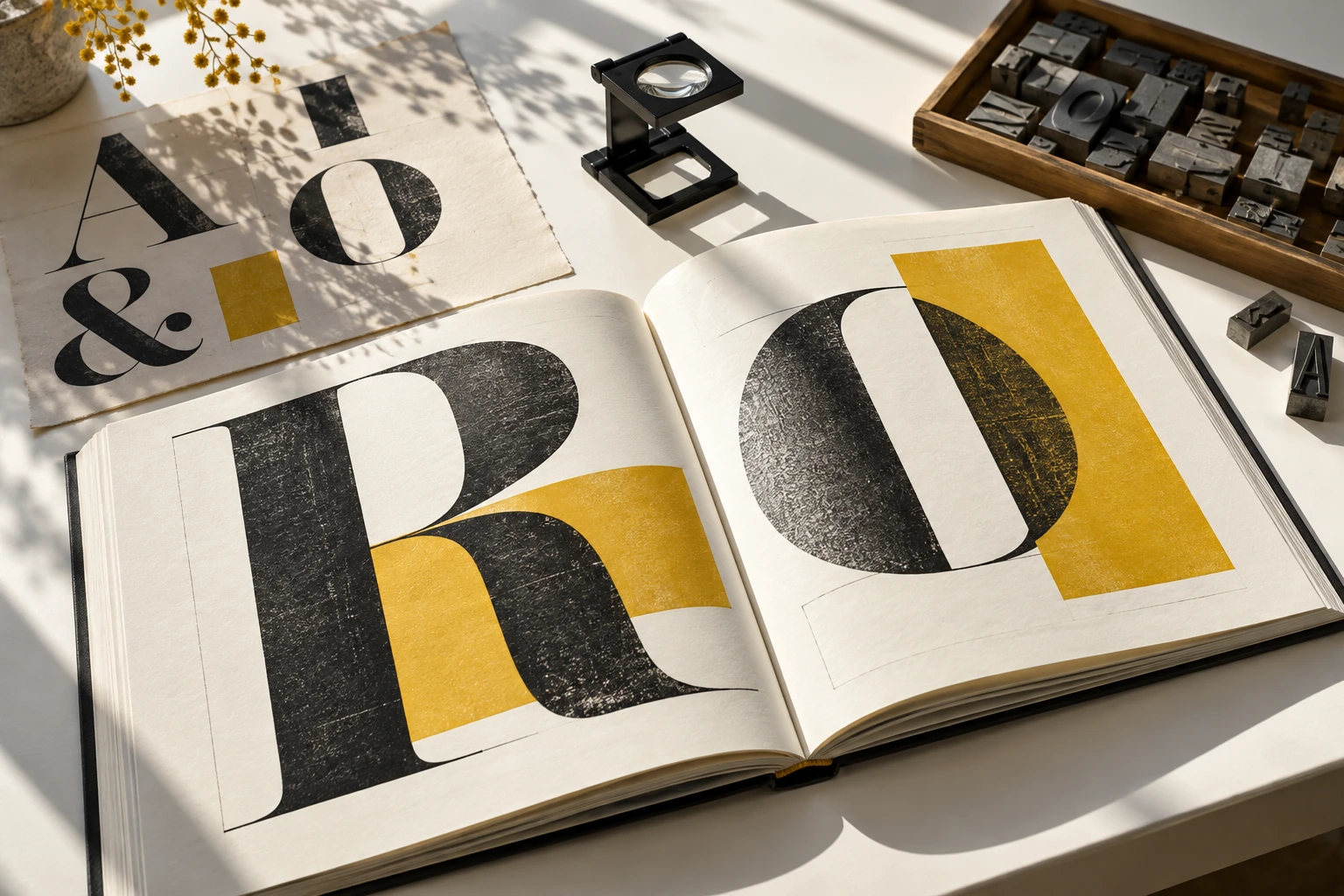
“Give every element a reason to be there.”
A working principle, not a rule for making everything quiet.
01 / Three editorial decisions
Decide where the reader should begin. A title, image or opening sentence can offer the first foothold. If everything asks for attention at once, hierarchy has not yet done its job.
Use density and space to set a rhythm. A short line can slow a reader. A long uninterrupted block can ask for sustained attention. Match the pace to the kind of reading you intend.
Repeat enough to make navigation dependable. Then use a deliberate change to signal a new kind of content. Consistency is useful when it helps the reader understand the page.
02 / The live specimen
Adjust one control at a time. Watch where your eye returns at the end of each line, and how the paragraph holds together.
A paragraph, in practice
A page begins before the first word is read. Its margin sets a distance, its heading offers a point of entry, and its lines suggest a pace. The reader moves through these signals almost without noticing them.
The designer's task is to make that movement feel considered. A useful page does not ask every element to compete. It gives each part a place in a larger conversation.
20 px · 1.6 line spacing · 42 ch measure · Georgia
The proof is a reading tool
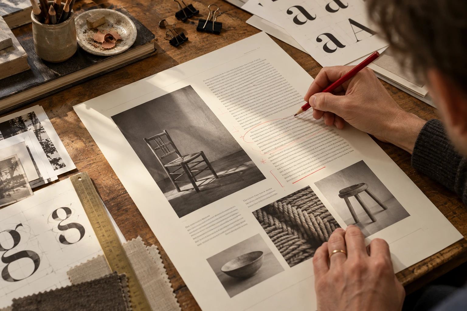
A screen encourages zooming. A printed page gives the reader one physical scale. Print an early version and look for the places where the rhythm breaks.
03 / Type meets the process
Ink, pressure and paper change the way a letter appears. Fine details that work on a bright display may not survive the chosen process.
Test with the actual production method whenever possible. Keep a reference proof and compare the smallest type, solid areas and reversed details.

04 / At the edge of the page
Leave room for the physical process. A trim line, a folded edge and a printed mark never behave quite like the lines on a screen.

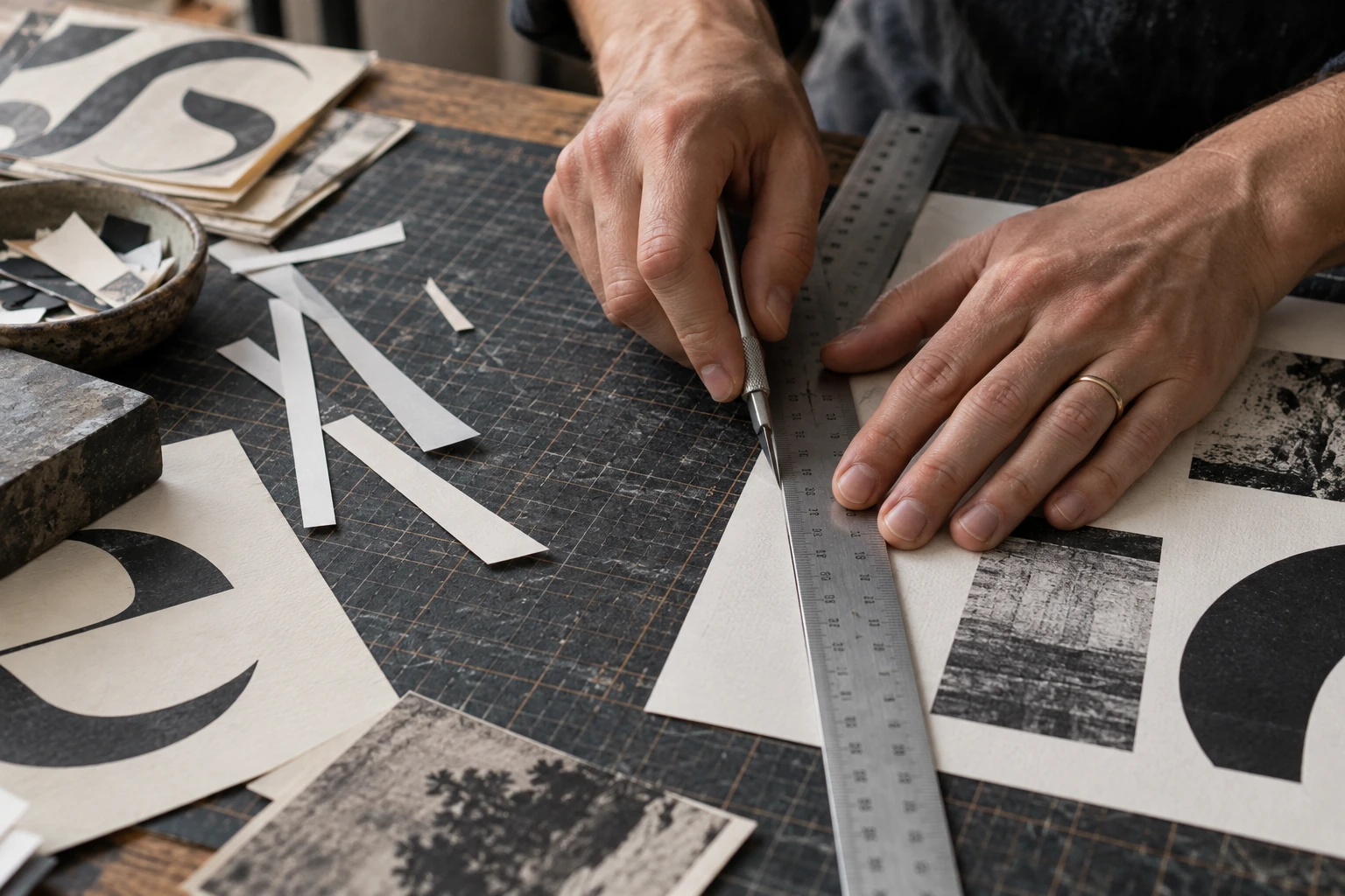
Keep important content clear of the trim.
Confirm production tolerances with the process you will use.
Judge contrast on the real stock.
Paper colour and surface are part of the result.
05 / Build a useful hierarchy
A heading, a caption and a paragraph do not need the same treatment. Start with their roles, then choose the differences that make those roles visible.
The body text carries the idea at a sustainable pace. Its texture should support reading over more than a single line.

06 / A reader in the room
Give a reader a simple task: find a section, explain a caption, or tell you what the page is about. Watch the route they take.
“What did you read first — and what did you miss?”
Useful feedback describes an experience. Turn it into a specific change, then test the page again.
07 / Beyond a single spread
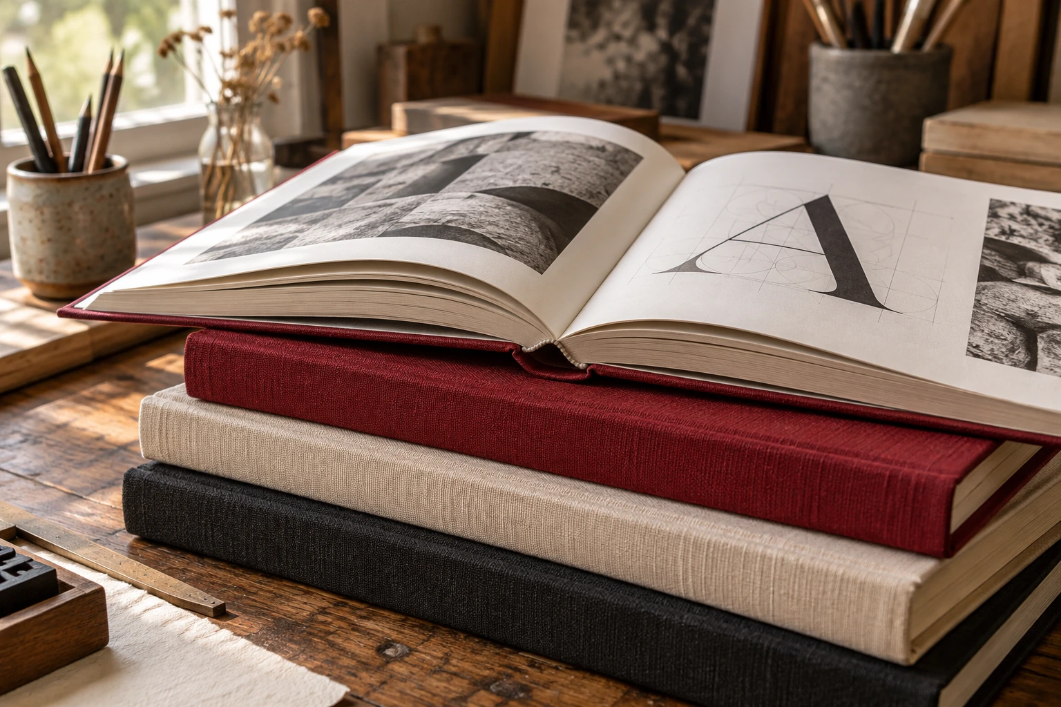
Lay out several spreads together. Compare openings, dense passages and moments of rest. A strong page still needs to belong to a larger sequence.
08 / From specimen to publication
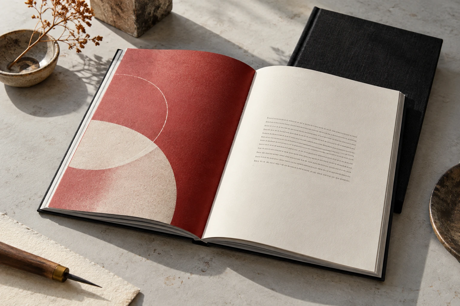
Finishing is a series of checks, not a decorative layer. Make sure the object still supports the reading experience you set out to create.
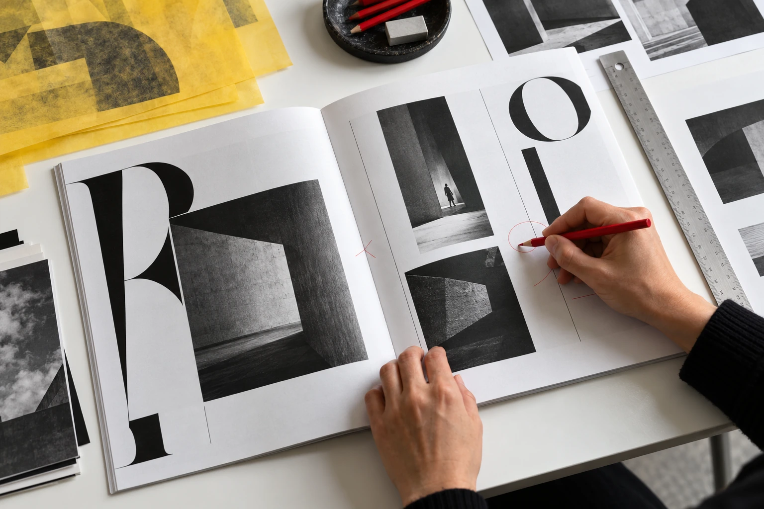
Close the design software. Read the physical object in order, with no zoom and no guides. Note anything that interrupts understanding.
About this editorial practice →09 / Short exercises
Set the same paragraph at three measures. Keep the type size consistent and compare the return from the end of one line to the next.
Create a title, paragraph and caption using one typeface and black ink. Use size, spacing and position to distinguish their jobs.
Adjust only the line spacing of a dense passage. Print the alternatives and compare them at the intended reading distance.
Make a four-page sequence in which the turn reveals a new relationship. Keep the content simple enough to notice the timing.
4 entries shown.
10 / Before the final export
Review the page as a reader, then mark the completed checks. Your marks last only for this visit.
11 / Notes in the margin
No single measure suits every typeface, size, reader or purpose. The live specimen helps you compare relationships; a proof in context helps you judge them.
Begin with the roles the content needs. One versatile family may be enough. Add another only when it provides a useful distinction.
A grid can organise relationships without announcing itself. Its value is in the clarity and consistency it makes possible, not in how rigidly every element follows it.
No. The exercises are ways to observe and test editorial decisions. A poem, a reference manual and a poster ask for different kinds of reading.
12 / Letters to the fieldguide
Tell us which page or exercise you are working with. Describe the reading problem you want to understand.